01Behaviour notes
Watch the work
Follow a car from arrival to departure and pay attention to interruptions, handoffs, and the information people repeat aloud.
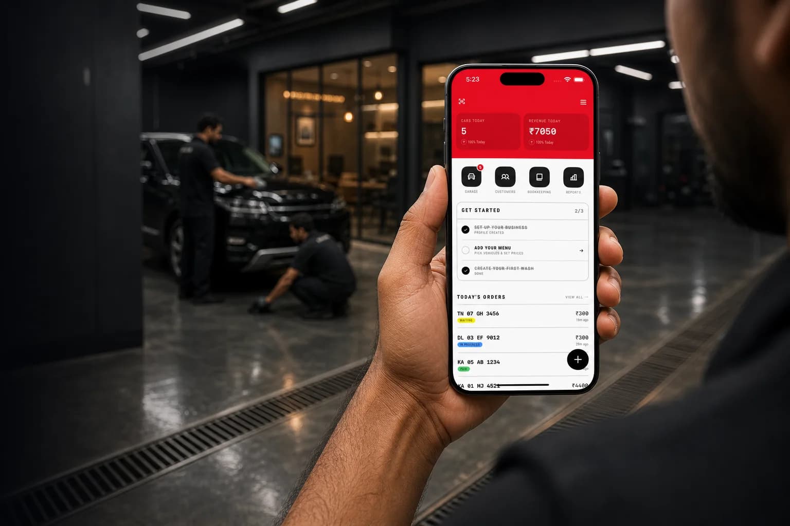
A car wash shop is a deceptively hard operation. Cars arrive without appointments, sit in bays in different states of done, get worked on by staff who rotate, and leave after a payment that someone has to remember to collect. The default tooling for all of this is a notebook, a whiteboard, and a WhatsApp group.
That stack fails in specific, expensive ways. Cars get forgotten mid-queue. Payment gets missed because the person who washed the car isn't the person at the counter. Customers come back disputing damage with no record either way. And at the end of the month the owner has no idea which services actually made money or when they were busiest.
The competition isn't other software — it's the notebook, and the notebook is genuinely good at some things. It never crashes, it works with wet hands, it needs no training, and it costs nothing. Anything replacing it has to be faster than writing one line by hand, or it simply won't get used past the first busy Saturday.
MintWash was designed for work done standing up, with wet hands, moving between a customer, a car, and a wash bay. These contextual reenactments show the three moments the product has to make simpler: queueing, proof of work, and payment.
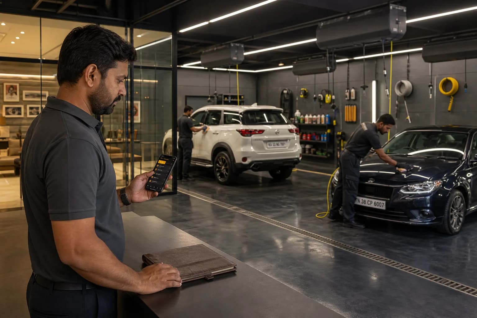
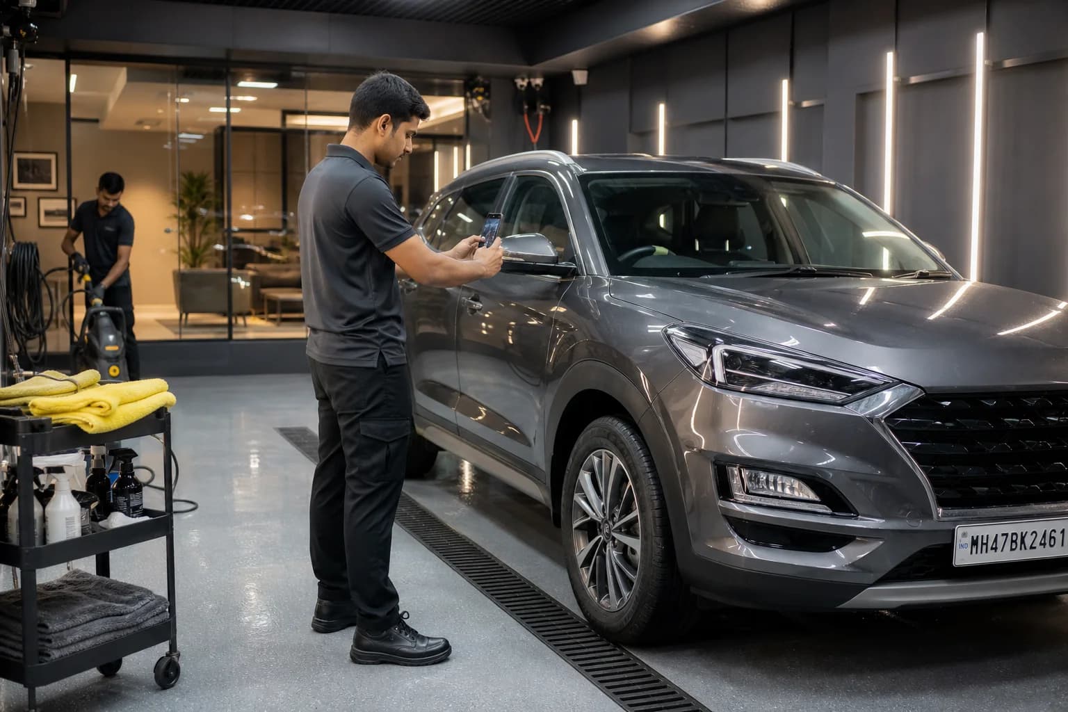
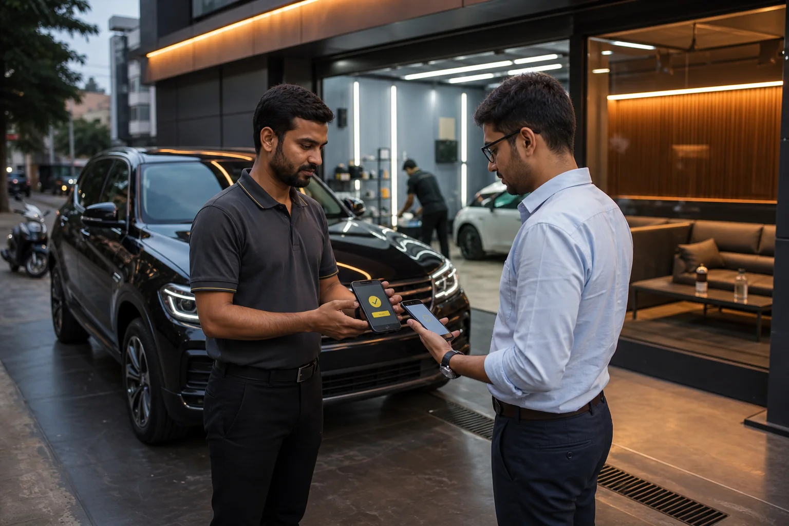
I was researching, designing, and engineering MintWash at the same time, so the work did not move through four clean textbook phases. It moved in short loops: watch a real task, map where it breaks, prototype the smallest correction, then test it against the whole wash. This is a retrospective synthesis of that process—not a decorative design-thinking diagram.
Follow a car from arrival to departure and pay attention to interruptions, handoffs, and the information people repeat aloud.
Lay the physical workflow beside the notebook, WhatsApp, and UPI trail to see where state or responsibility disappears.
Test the smallest complete flow first: identify the car, move it through the bay, prove the work, and close payment.
Use realistic plates, prices, queues, and failure cases while building so every screen is tested as part of a shift, not in isolation.
Methods and prompts
I used the live operation as the research stimulus. Asking someone to reconstruct a normal day from memory produced feature requests; looking at the car currently in the bay exposed behaviour.
“How do you know what needs attention next?”
Talk at the counter, using the current queue and recent disputes as prompts instead of asking abstract questions about features.
“Where does ownership change hands?”
Track the car, the keys, the job details, and the payment across the owner, washer, and customer—not just what happens on a screen.
“What already works well enough to survive?”
Treat notebooks, paper receipts, WhatsApp threads, and UPI confirmations as existing interface patterns with strengths worth preserving.
“Can this beat one line in a notebook?”
Walk through complete jobs with familiar vehicle types, plate numbers, and prices; simplify any step that needs explanation.
Service blueprint
Mapping the physical job beside the information trail made the opportunity clear: MintWash did not need to invent a new process. It needed to keep a reliable thread through the existing one.
Synthesis
I wrote the recurring behaviours as rules rather than feature requests. That made them useful beyond one screen and gave me a consistent test for later decisions.
Signal
People point to a car or say its plate; they rarely use the customer’s name.
Decision
Make the registration number the primary identifier everywhere.
Signal
Staff think in cars waiting, being washed, or ready—not abstract order statuses.
Decision
Call the operational view Garage and mirror those physical states.
Signal
Damage and payment disputes are failures of evidence, not reminders.
Decision
Put before/after photos and payment inside the state machine.
Signal
Owners need today’s count and cash position before deeper reporting.
Decision
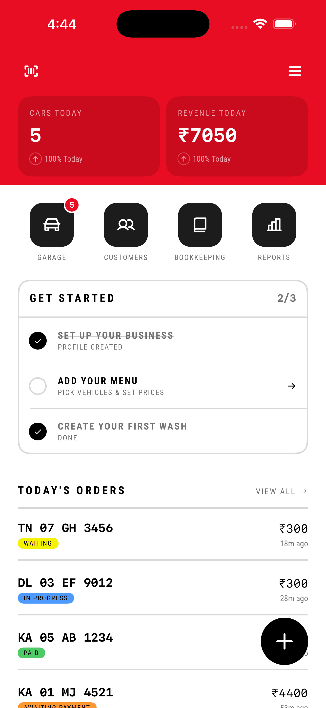
Give cars and revenue the highest visual priority on Home.
Operators never learn customer names. They recognise cars. Every list, search field, and receipt leads with the registration number in monospace — never a name, never an order ID.
Cars today and revenue today answer the only questions an owner asks before 9am. They sit above the fold in the accent band, in the largest type on the screen.
A wash can't start without a before photo and can't be paid for without an after photo. The camera isn't a feature — it's the state machine's gatekeeper.
Flat fills, no shadows, no blur, no iOS chrome. Condensed headlines and monospace numerals. It reads like a printed job card because that's what it replaced.
Four states, three gates, no shortcuts. Two of those gates are the camera — the wash cannot start without a before photo and cannot be paid for without an after photo. That single constraint is what turns the two most-cited problems above into structural impossibilities rather than things staff are asked to remember.
Photo timestamps double as the duration data — the elapsed timers in Garage and the busiest-hour histogram both fall out of this flow rather than being tracked separately.
A deliberately flat map. Everything hangs off Home one level deep, so nothing is ever more than two taps from the dashboard and there is no navigation to learn.
The path that has to beat writing one line in a notebook. Four taps, plate number last, because that is the moment the customer is standing in front of you reading it out.
High contrast, flat surfaces, condensed type, and colour reserved for status. A compact system, shown with the values used in the shipped product.
Colour
Vehicle language
Side profiles distinguish the vehicle at a glance. Neutral volume, dark glass, soft ground shadow, yellow wash sparkles.


Typography
Display · Roboto Condensed Bold
Cars today
Data · System Mono
₹7,050
Label · Condensed Medium
KA 01 MJ 4521
Spacing · 4pt base
Shape
Components in use
KA 01 MJ 4521
18 min ago
Each group follows one part of the job from observation to interface decision and tradeoff. Additional screens can extend a group without changing the reading order.
Splash to verified number — the whole way in, before any account exists.
5 screens →


What I found
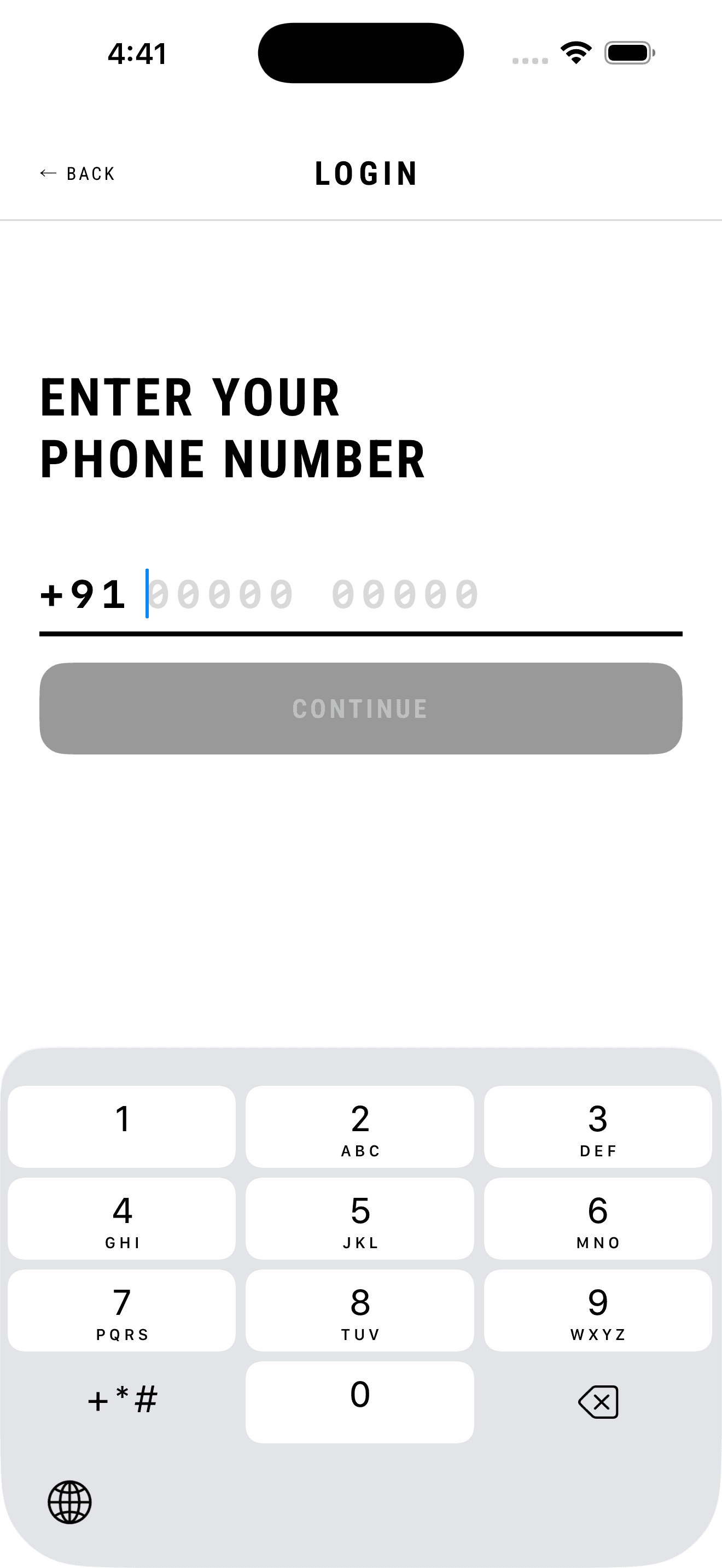
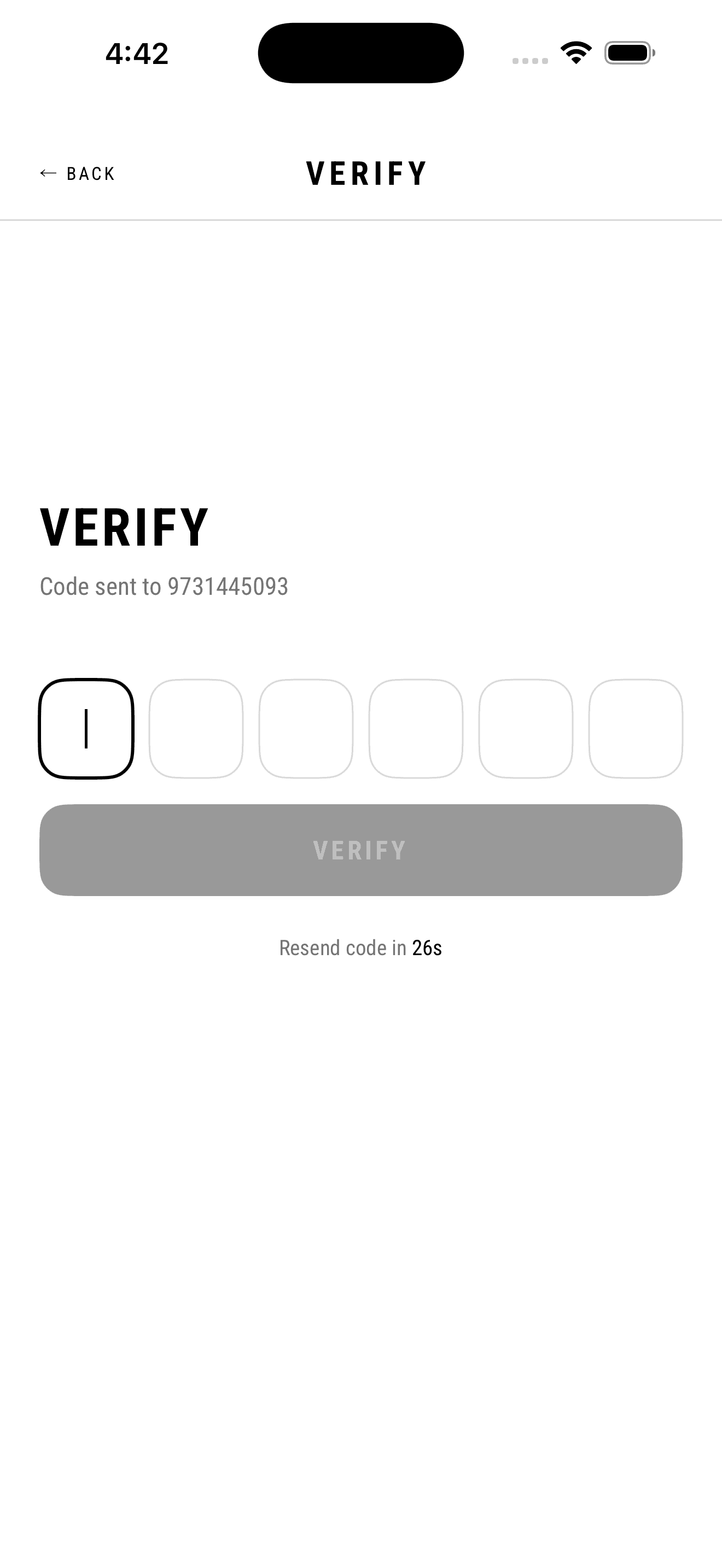
Two things decide whether a shop ever reaches a first order. The first is credibility: small operators judge unfamiliar software the way they judge a workshop, on whether it looks like someone serious made it, and software that looks like a school project doesn't get trusted with money. The second is the sign-in itself — this market is phone-first and password-hostile. The people using this already authenticate with an OTP several times a day for UPI payments, so that pattern is completely internalised. Email addresses, by contrast, are often shared, half-remembered, or belong to a relative who set the phone up.
What I decided
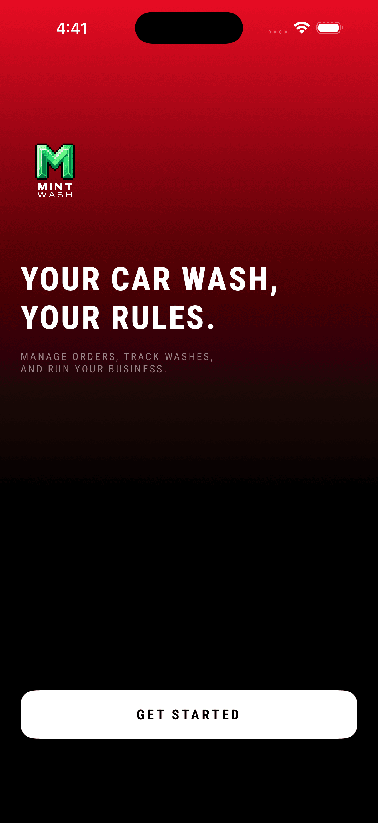
The splash is a black screen carrying only the pixel-art wordmark in signal green, with a car photograph pushed to the bottom-right corner and mostly swallowed by shadow. No tagline, no spinner, no marketing copy — the restraint is the message. Its two seconds are also doing real work, resolving cached auth state so the next screen is either the dashboard or the welcome, never a flash of the wrong root. It hands over through a single full-bleed red frame, the one moment of brand colour before the product turns almost entirely monochrome. The welcome then commits to one path in: phone OTP only, and a single GET STARTED button instead of the usual Sign up / Log in fork. The headline — YOUR CAR WASH, YOUR RULES — argues ownership rather than features, because the fear being addressed isn't 'will this work', it's 'will this company end up telling me how to run my shop'.
What it cost
A fixed splash duration is time taken from the user on every launch, accepted because routing instantly and occasionally flashing the login screen at an already-signed-in user reads as broken — and looking broken is more expensive here than two seconds. Dropping the sign-up/sign-in fork costs more: the app has to silently decide whether a number is new or returning, every login costs an SMS, and there is no email fallback when someone changes their number. That's a real support burden I took on in exchange for the shortest possible path to a first order.
The two pages everything else hangs off — one for the shift, one for the shop.
2 screens →
What I found
Every owner I designed this for opens the app with the same two questions, in the same order: how many cars have we done, and how much money came in. Everything else — customers, expenses, staff — is a question they ask weekly, not hourly. A single page that treats all of those as equals fails the 9am glance, and a page that hides the weekly work entirely just moves the problem. So there are two, and which one a thing belongs on is decided by how often it gets asked.
What I decided
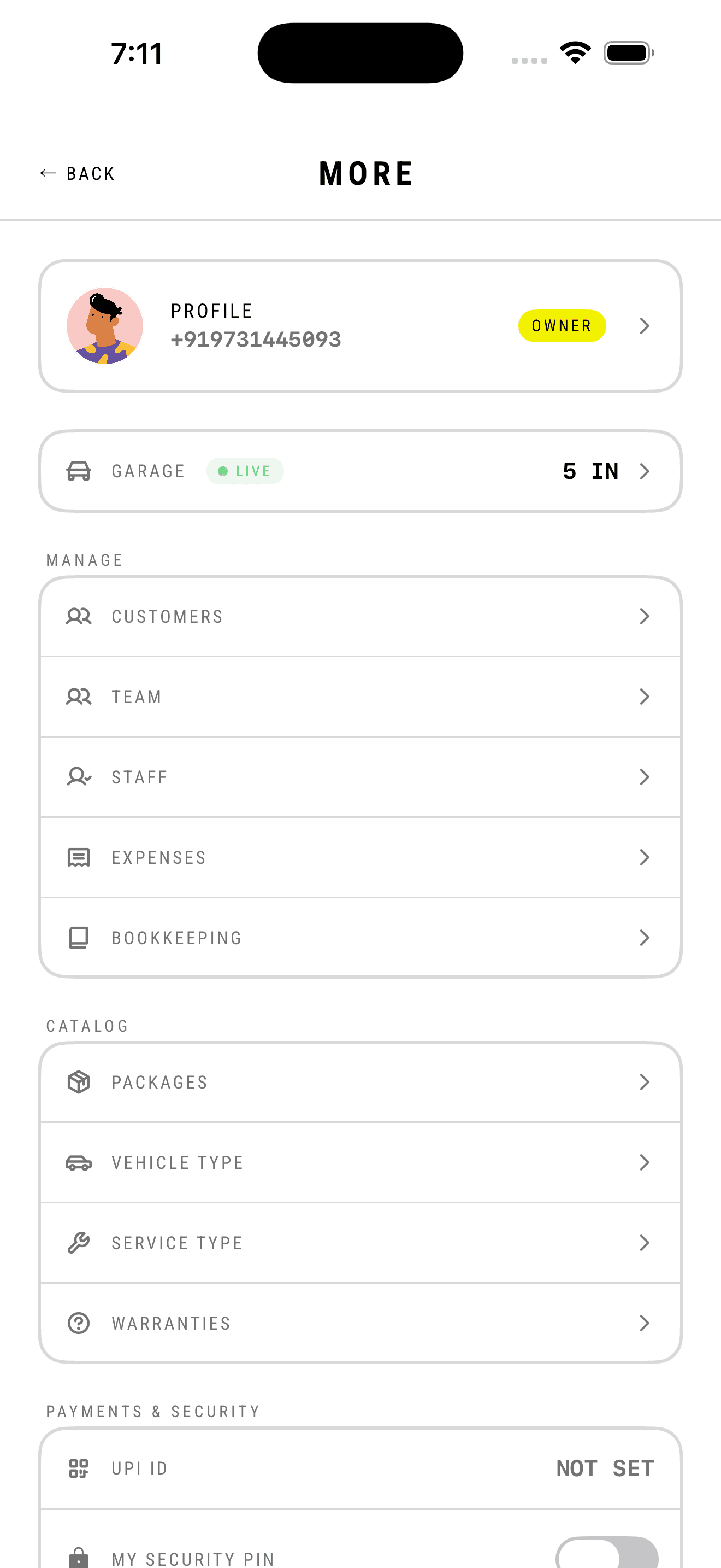
Home is the shift. The two numbers take the accent band at the top, in the largest type on the screen, with nothing competing; under them a flat strip of four quick actions, and under that today's orders as a dense list keyed by plate number, each with a colour-coded status pill and a relative timestamp. The Garage tile carries a live count badge, so the one number that changes minute to minute is visible without opening anything. Numerals throughout are monospaced, which keeps rupee amounts optically aligned down the right edge and makes the column scannable rather than ragged. More is the shop: everything the business configures rather than operates, laid out as a plain labelled hierarchy — Manage, Catalog, Payments & Security — with no icons doing work that words should do. It opens on the profile and repeats the live garage count at the top, so even the second page still answers the first question.
What it cost
The red band is heavy and it dominates the screen. I went with it because the two numbers underneath it are the reason the app gets opened at all, and a subtle treatment tested as ignorable in my own use. The GET STARTED checklist also occupies prime real estate during exactly the period when the screen is emptiest — it earns that space early and becomes clutter later, which is why it disappears at completion rather than collapsing to a dismissible row. Splitting into two pages keeps Home clean at the cost of burying things a new shop genuinely needs on day one; the checklist is what carries them there instead.
Three steps, built to be finished while someone is talking to you.
7 screens →
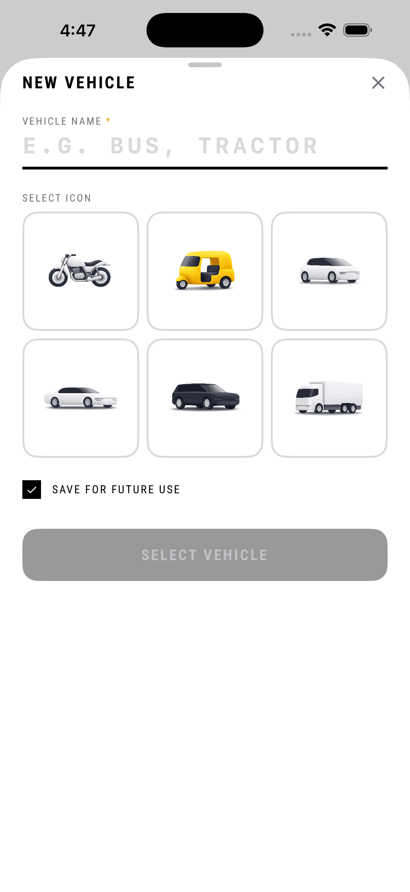
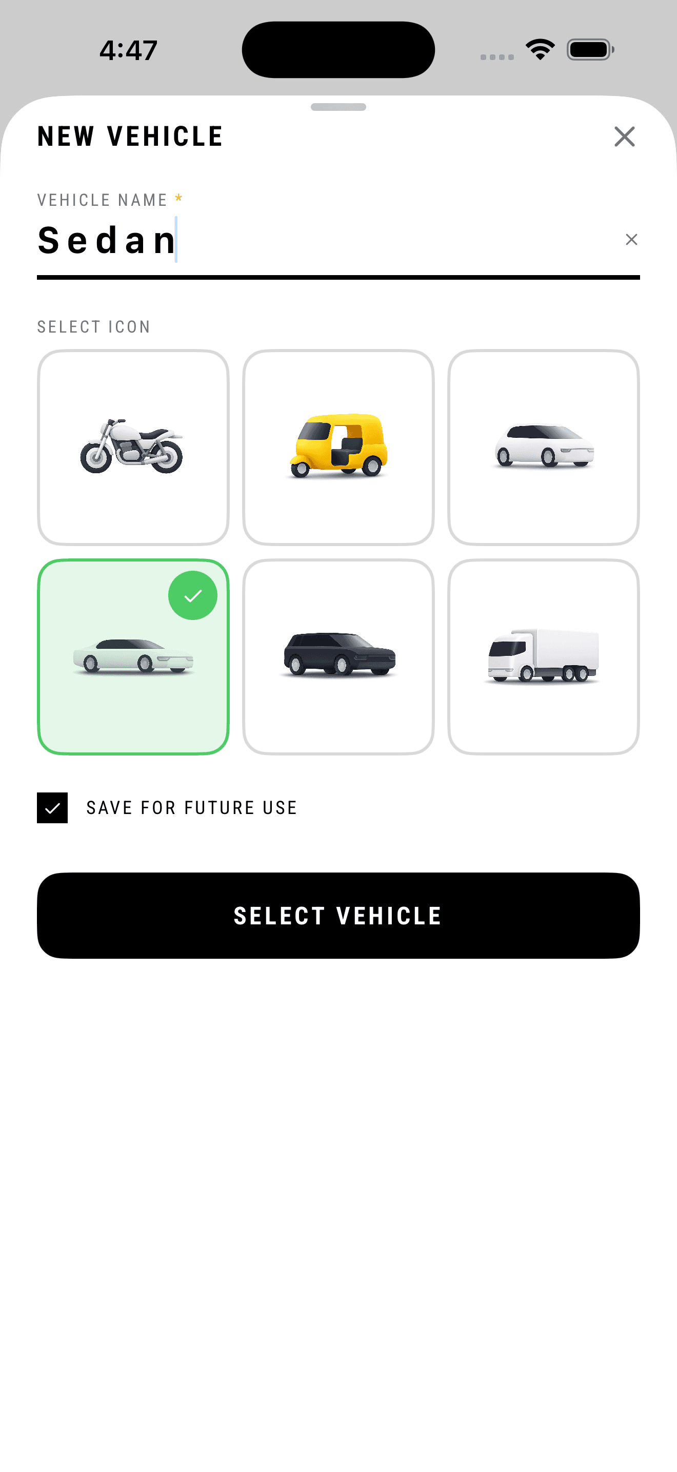
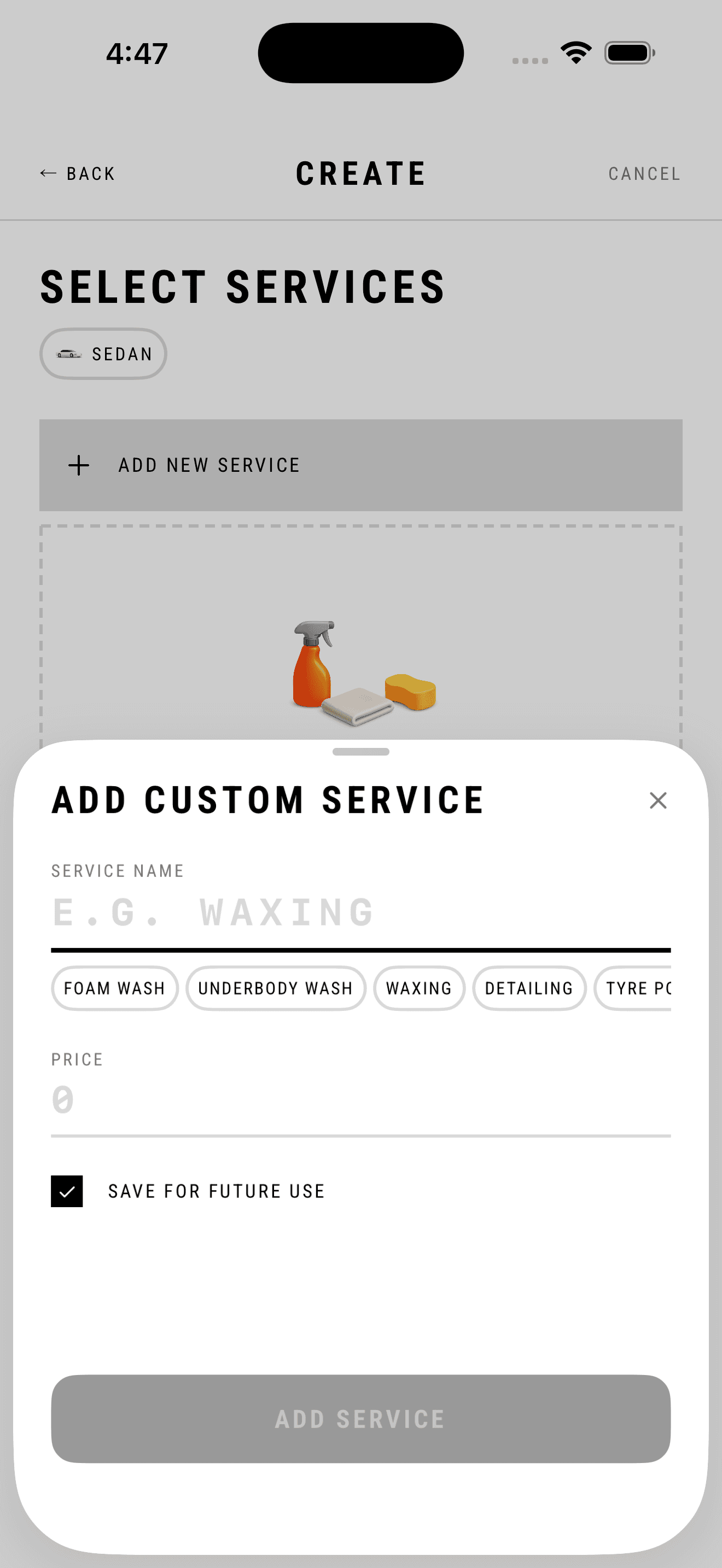
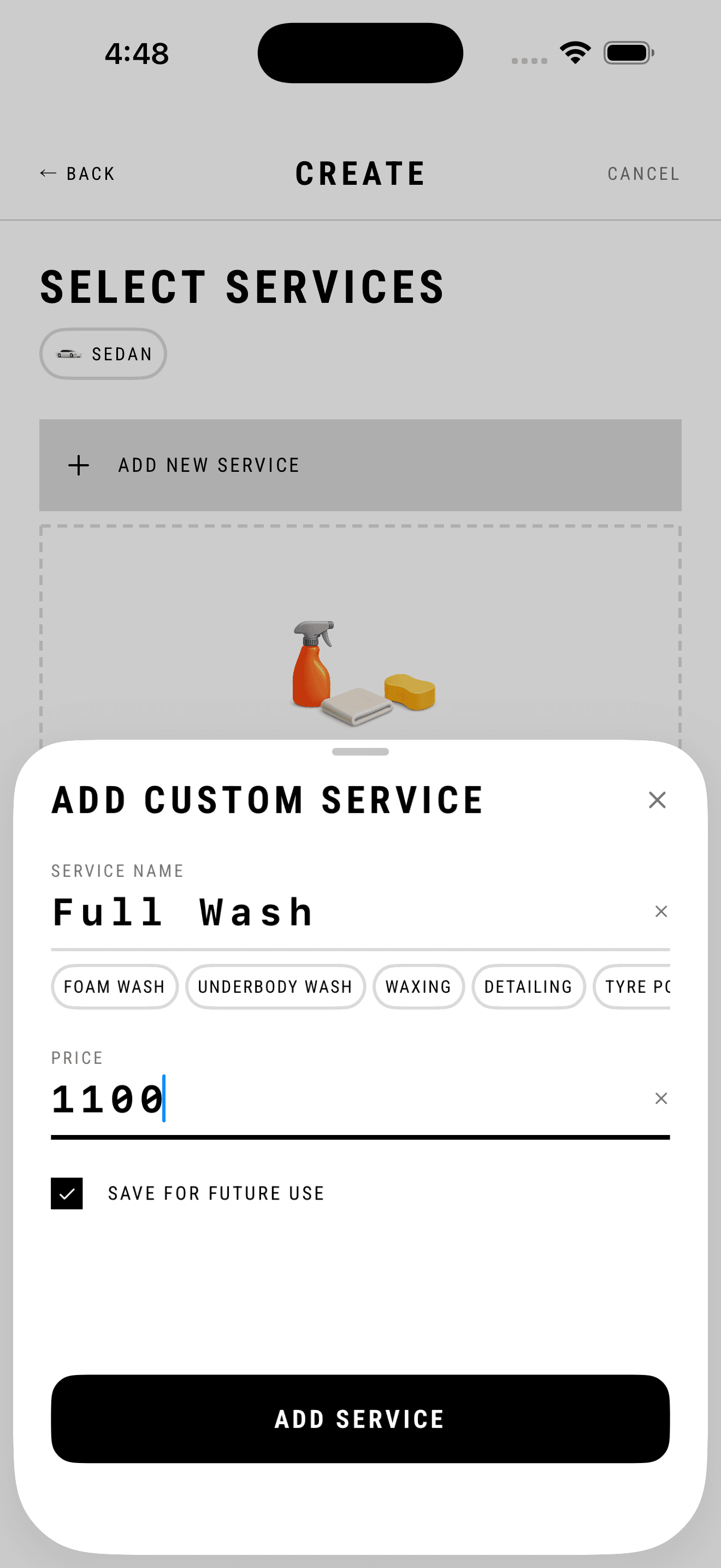
What I found
The order gets created at the counter with the customer standing there, usually mid-sentence, often while somebody else is asking about their car. Every field has to be answerable without turning around. The plate is on the vehicle and the phone number gets recited from memory; the vehicle type and the price are the only parts that need a moment of thought. The notebook line these shops already write follows the same order — the number first, then what work was done — so the sequence was never really mine to invent.
What I decided
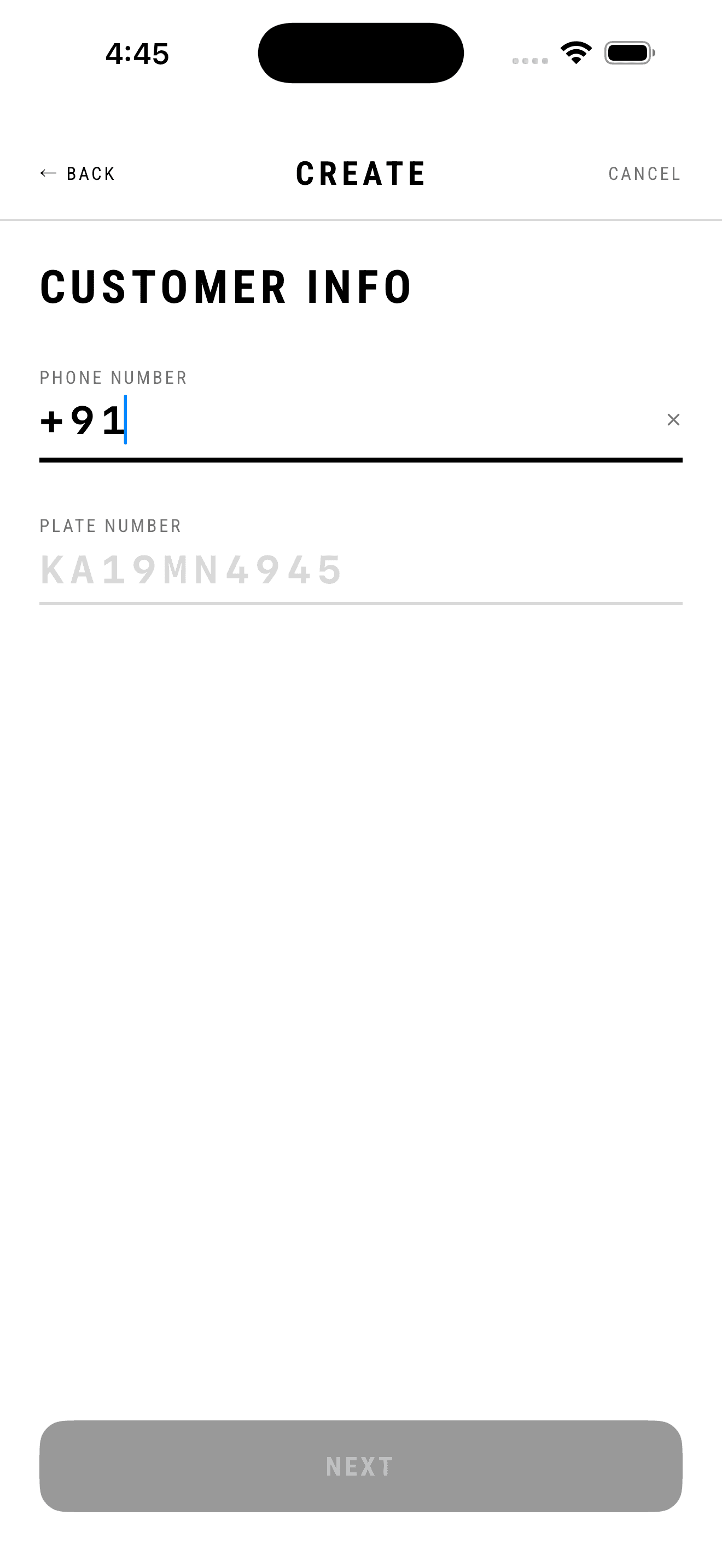
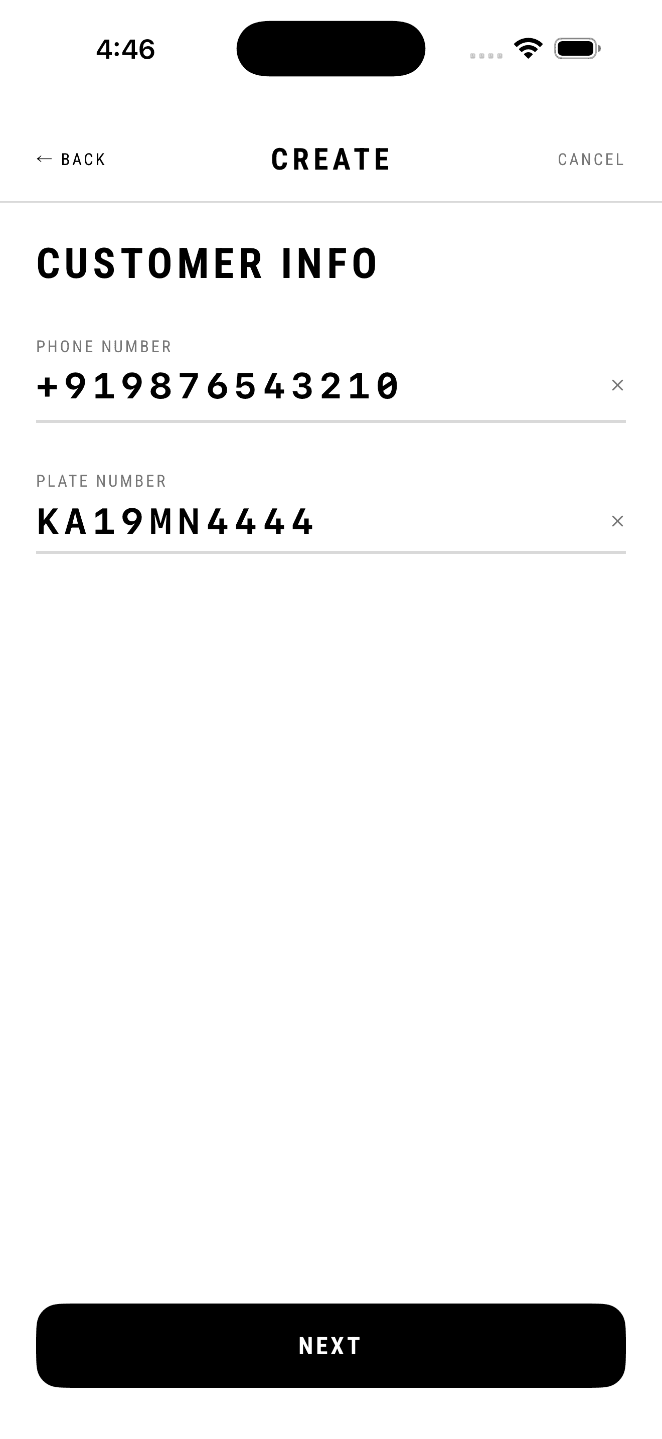
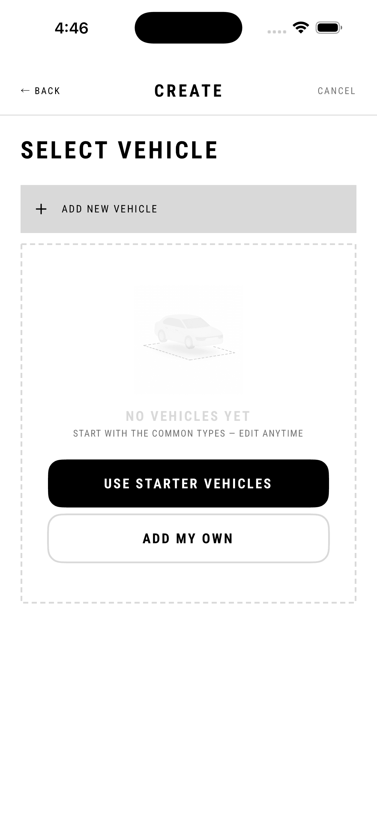
Phone and plate come first, on their own screen, because they are the two things the person in front of you can supply immediately. The country code is fixed, the plate placeholder shows a real registration in the local format so nobody wonders about spacing, and NEXT stays disabled until both are valid rather than accepting input and erroring afterwards. Vehicle type and services follow, each with an ADD NEW row pinned above the list that opens a sheet without leaving the flow. Those sheets default SAVE FOR FUTURE USE to on, which means the catalog assembles itself out of real orders instead of a setup wizard nobody completes. The custom service sheet offers the common names as chips — foam wash, underbody wash, waxing, detailing, tyre polish — so the usual case is a tap and a price.
What it cost
Saving by default means a shop that types 'Fulll Wash' once carries that typo in its menu forever, and near-duplicate services accumulate. I took the messy catalog because an empty menu at the counter stops an order dead, and a shop that has to go configure something mid-conversation goes back to the notebook and doesn't return. Three steps is also one more than the fastest possible version — a single scrolling form would be quicker for an expert — but it keeps each screen answerable in isolation, which matters more when the flow gets interrupted, and it always does.
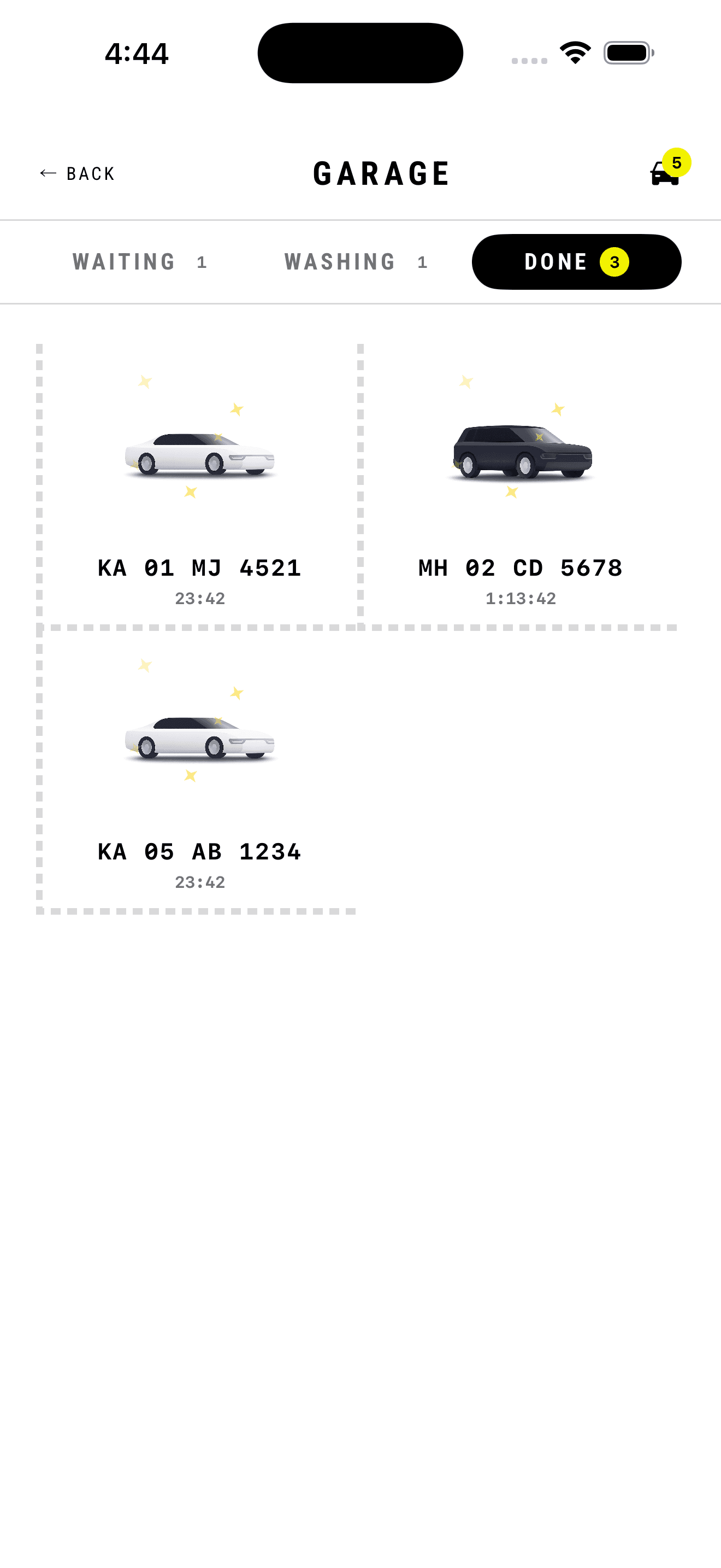
The physical bay, mirrored on screen.
What I found
Staff don't think in orders — they think in cars sitting in bays. Asking someone to translate 'the white sedan in slot two' into a list row is asking them to do work the software should be doing. The mental model already exists in the physical space; the interface should borrow it rather than replace it.
What I decided
This screen is called Garage, not Orders. Three segmented tabs — waiting, washing, done — each carrying a live count, mapping one-to-one onto the states a car can physically be in. Cars appear as tiles inside dashed outlines that read as painted parking bays, each with a vehicle illustration matched to its type, the plate number in monospace, and an elapsed timer counting up. The timers come free: they're derived from the before/after photo timestamps rather than a separate tracking mechanism.
What it cost
Illustrations per vehicle type mean an art asset for every category the product supports, and every custom vehicle a shop invents falls back to a generic mark — the metaphor degrades exactly where the product is most flexible. The dashed-bay treatment is also unconventional enough that it needs the tabs above it to carry the meaning; on its own it would read as an empty-state placeholder.
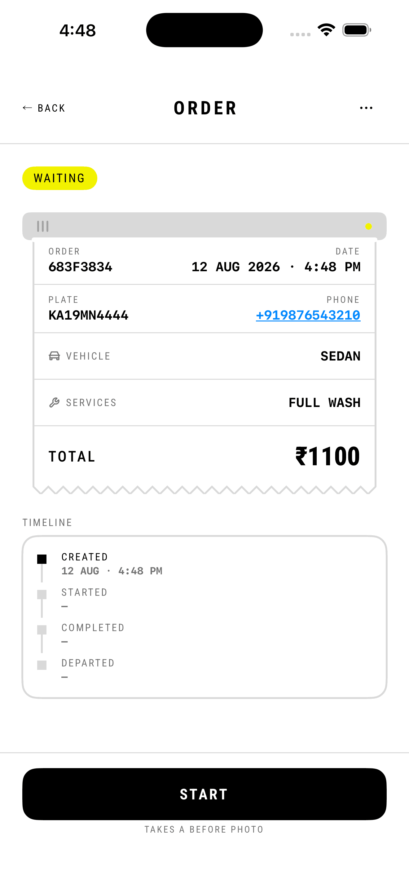
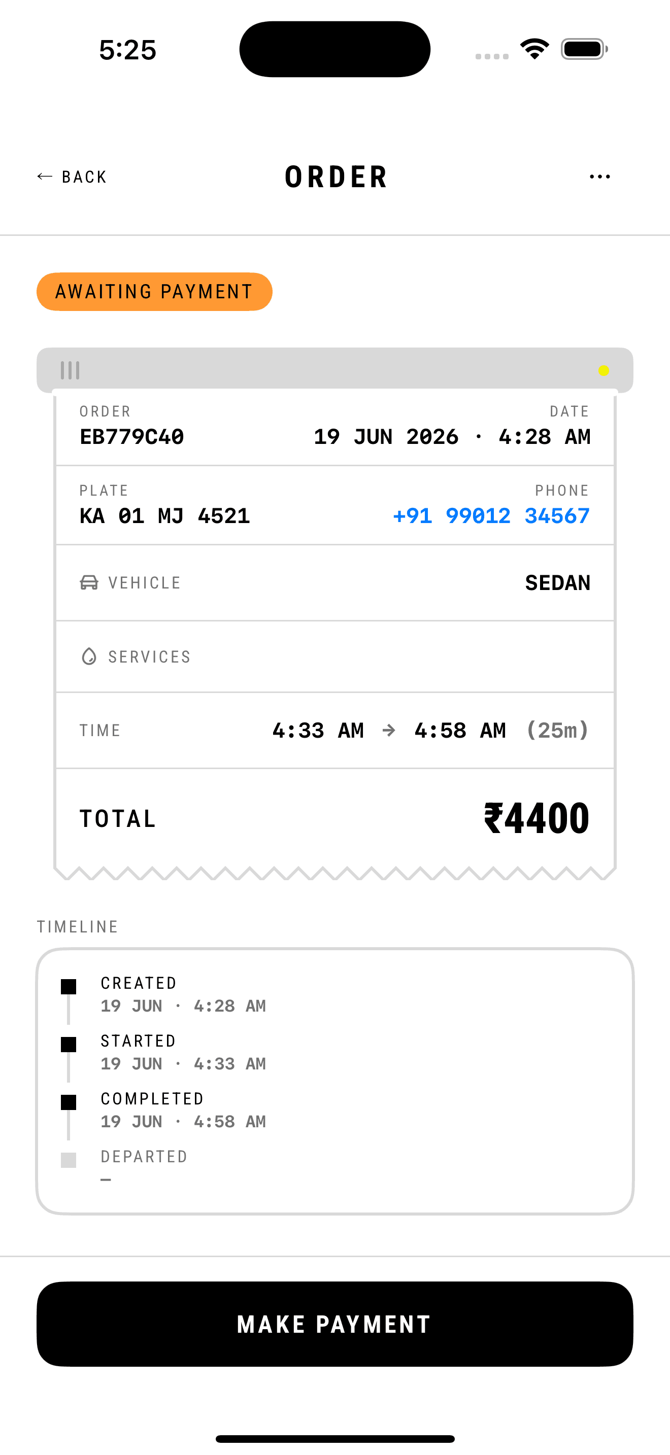
A receipt, because a receipt is what it replaces.
2 screens →
What I found
Two problems dominate the actual job. The first is disputes — a customer returns claiming the car was scratched or never properly washed, and the shop has no evidence. The second is leakage: work gets done and payment quietly never gets collected, because the person who washed the car isn't the person who takes the money.
What I decided
The order renders as a paper receipt, down to the torn zigzag edge, because the paper slip is the artefact this screen replaces and the familiarity is worth more than novelty. Underneath it, an explicit timeline — created, started, completed, departed — gives an audit trail with timestamps. The status flow is enforced rather than advisory: a wash can't move to in-progress without a before photo, and can't reach paid without an after photo. Payment is gated behind that after photo, which structurally prevents collecting money for work that wasn't finished. The payment CTA is pinned to the bottom so it's reachable one-handed while standing next to the car.
What it cost
Photo gating adds real friction to every single wash — two camera interactions on a busy Saturday, multiplied across dozens of cars, is a meaningful tax. It also means a dead phone battery halts the workflow entirely. I kept it because the disputes it prevents are far more expensive than the seconds it costs, but it is the single most likely thing to get worked around by staff in a rush.
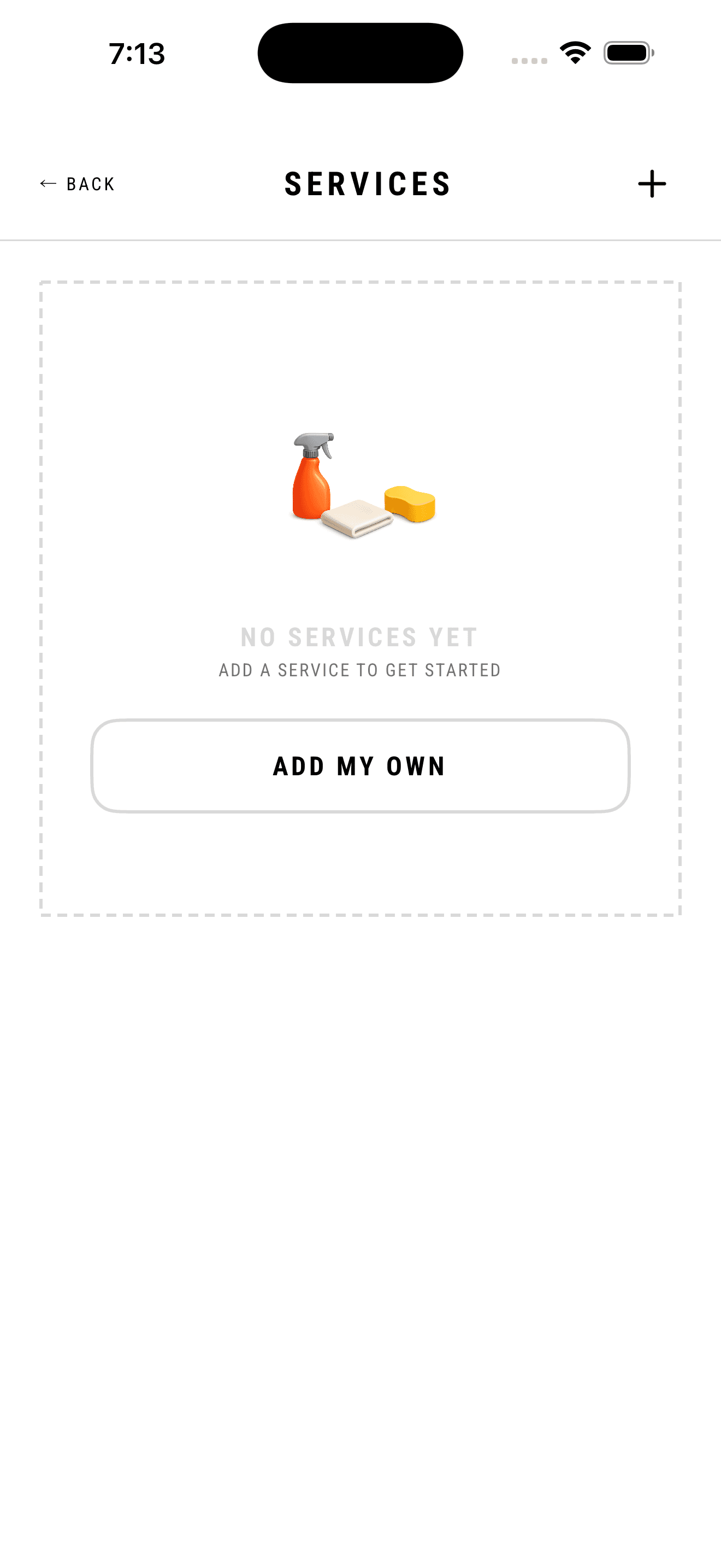
What the shop sells, defined without a setup wizard.
6 screens →
What I found
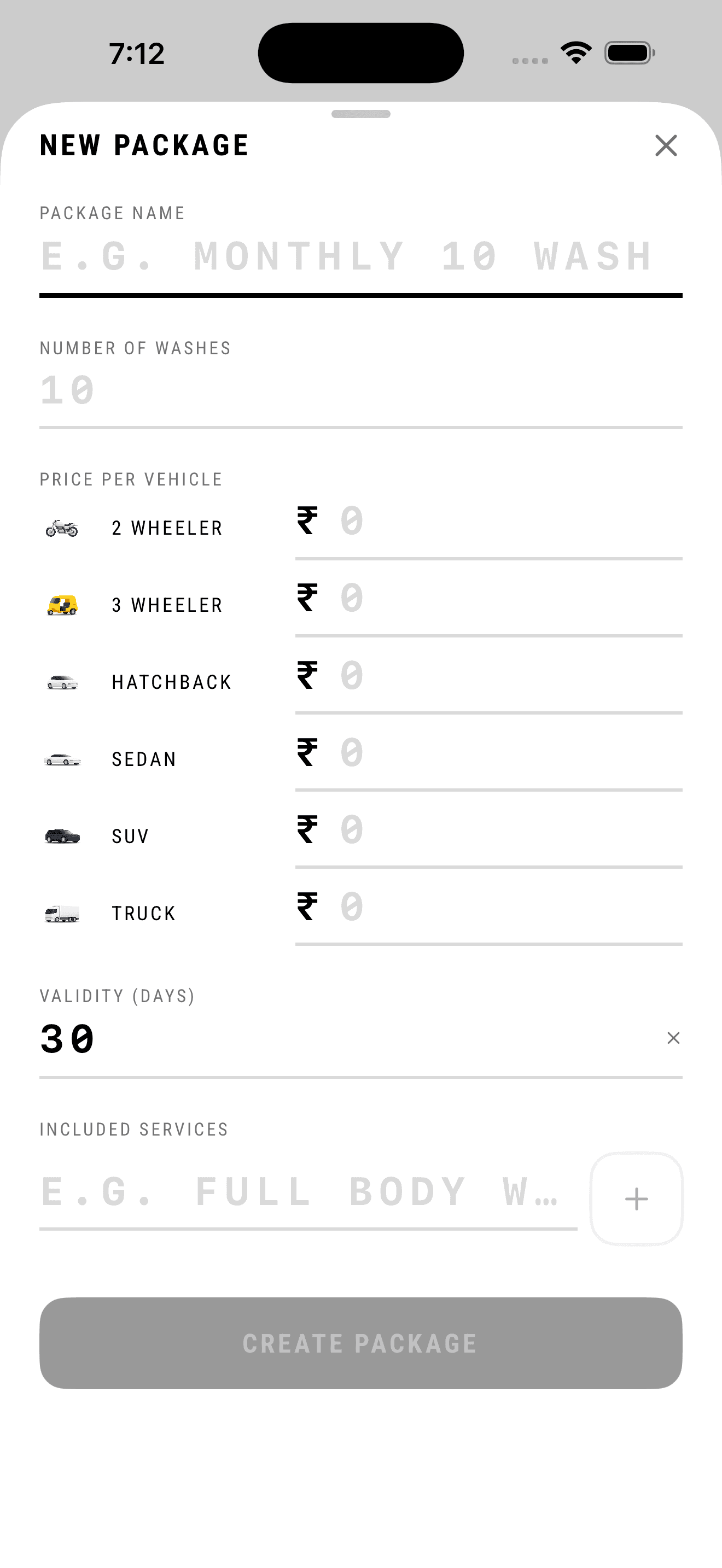
Nobody configures a catalog before their first wash. Every shop I looked at had the menu in the owner's head and on a board by the gate, adjusted per customer and per car, and none of it was written anywhere a piece of software could read. Pricing is genuinely per vehicle: the same monthly package is worth different money for a two-wheeler and a truck, and a service that takes ten minutes on a hatchback takes half an hour on an SUV. A catalog screen that asks for all of that up front is a wall in front of the product.
What I decided
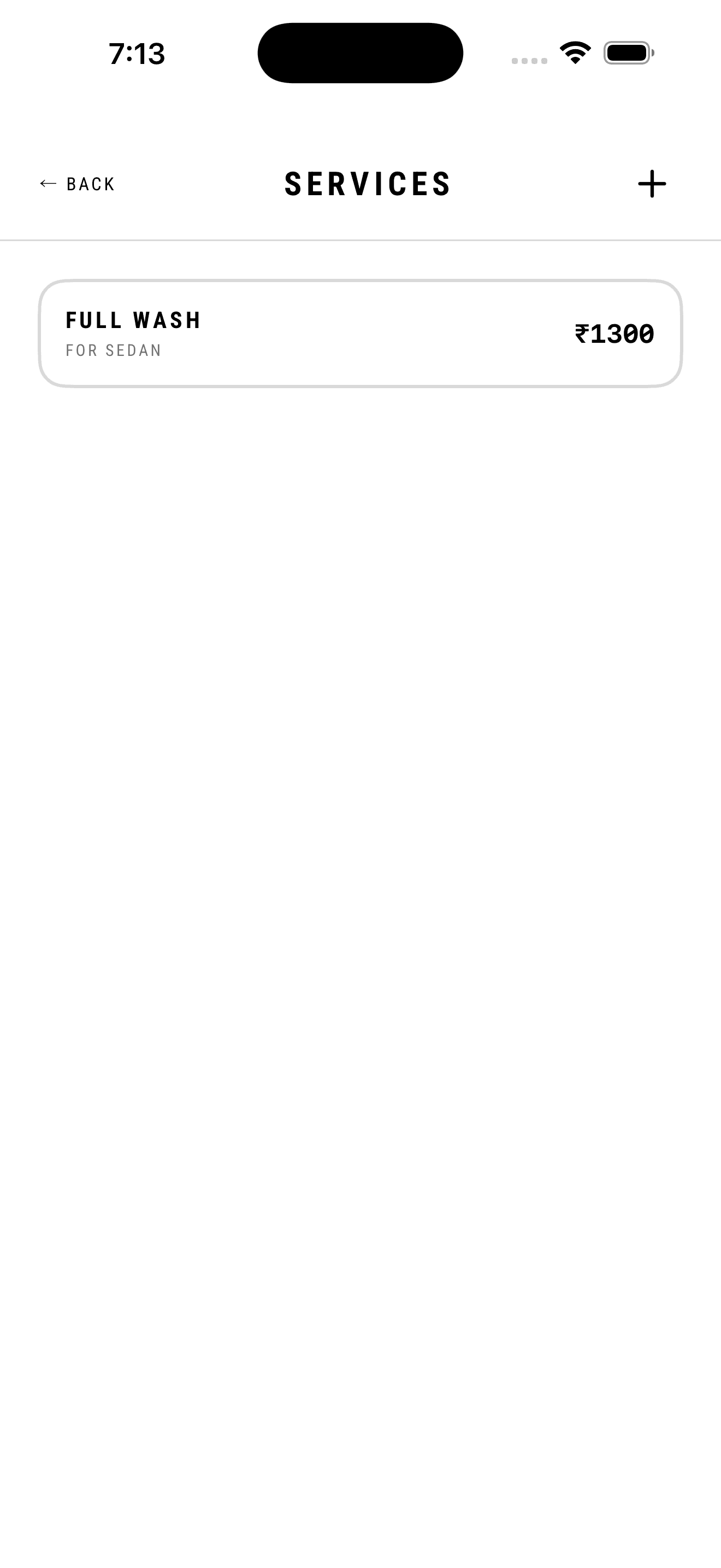
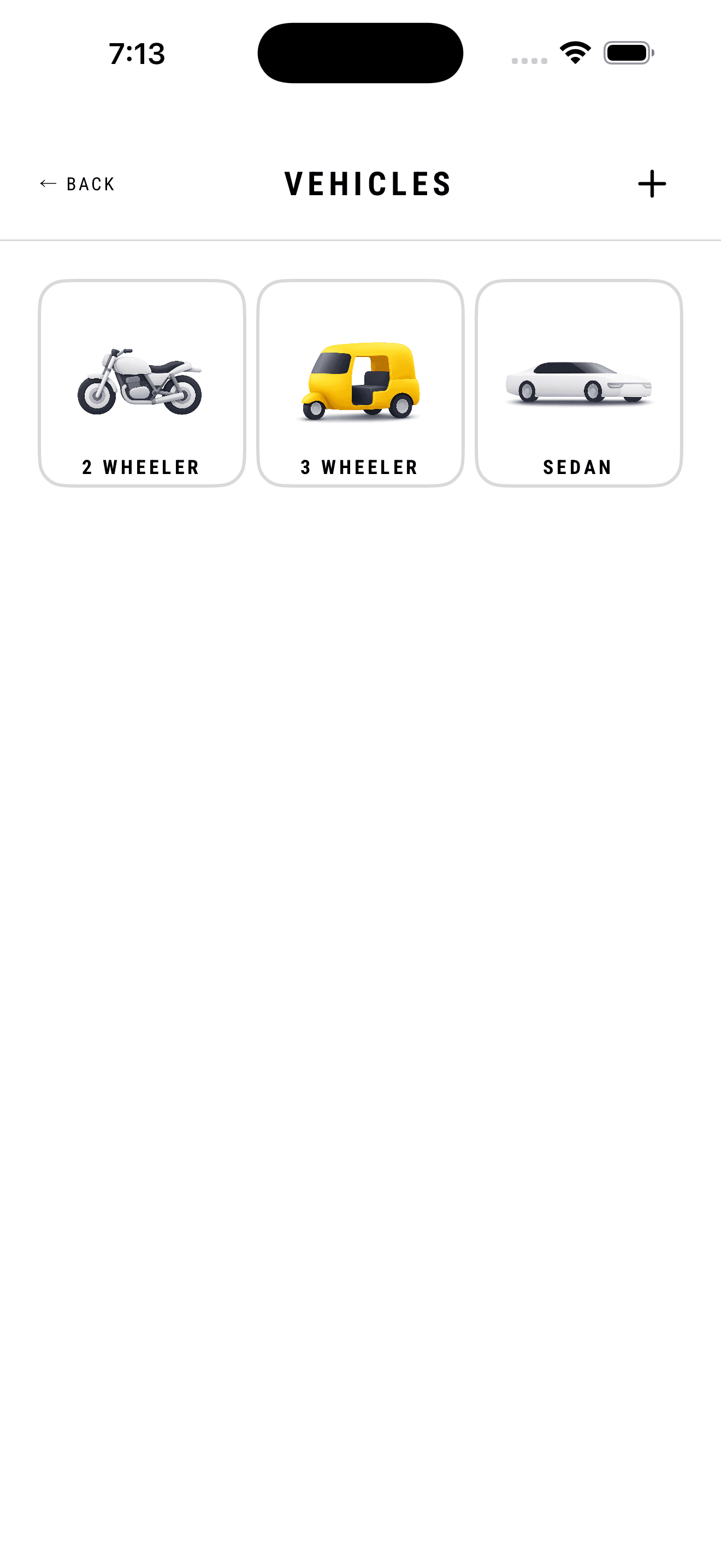
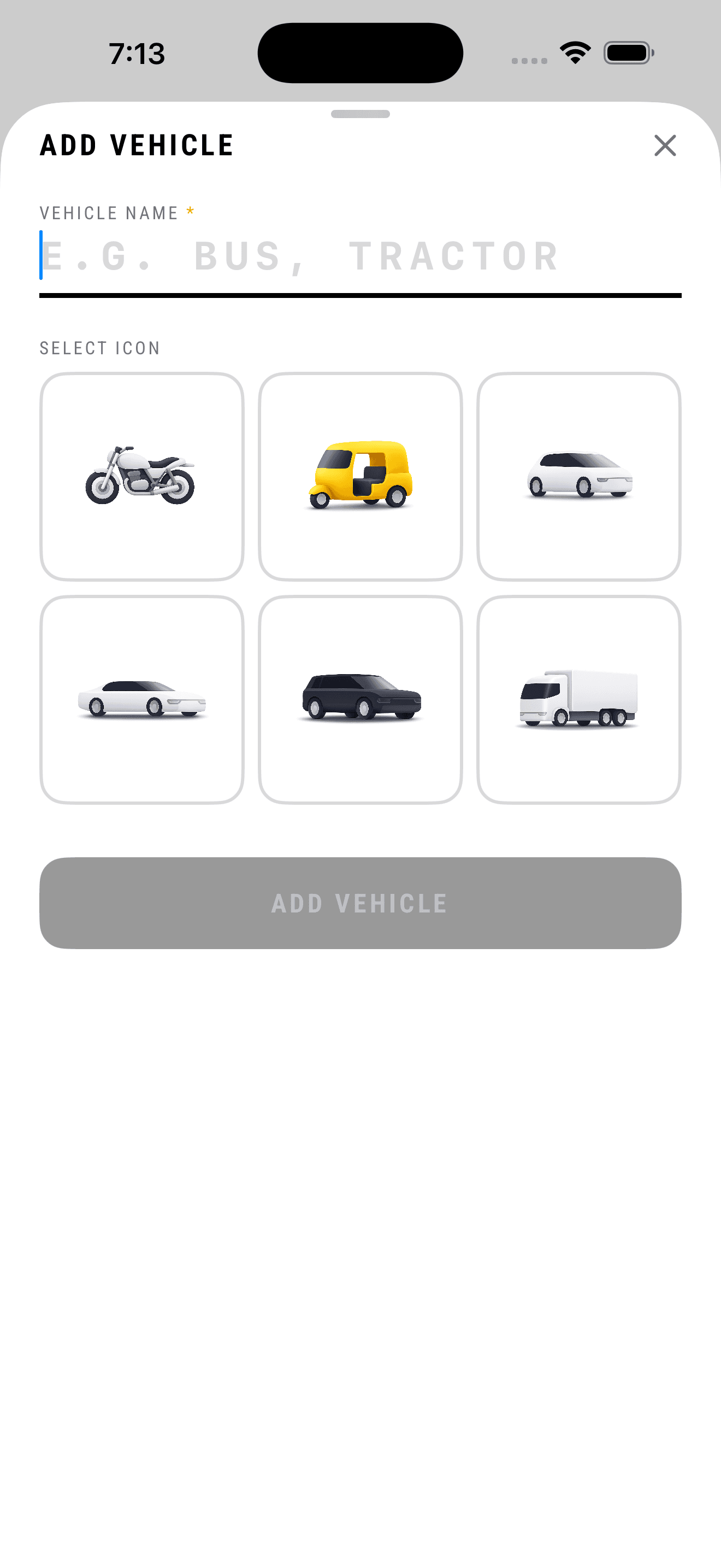
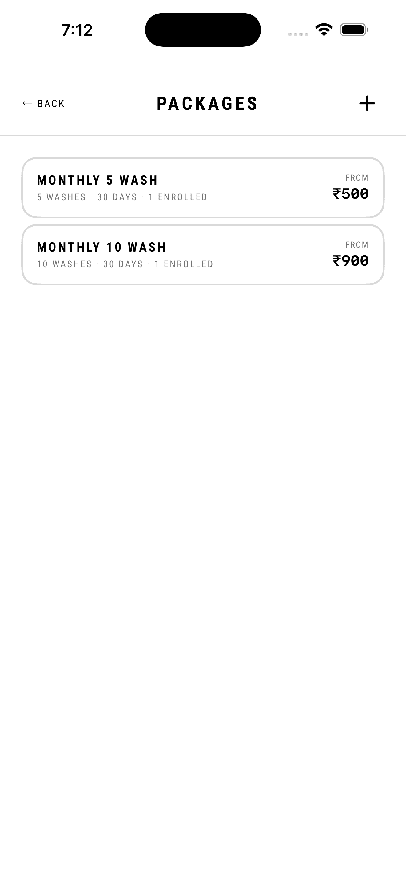
The catalog lives behind More rather than in the primary navigation, and every list ships empty with a way out rather than a blank page. Vehicle types offer one tap to load the six common Indian categories — two- and three-wheeler through to truck — or ADD MY OWN for the shop that runs buses and tractors. Services are priced against a vehicle type, so the list reads 'Full wash, for sedan, ₹1300' instead of a price that's true for nothing. Packages take the same idea further: one form, a row per vehicle type, plus a wash count and a validity in days, because a subscription that doesn't say when it expires is a dispute waiting to happen. The lists themselves carry the operational facts — how many customers are enrolled in a package, what a service costs — so the catalog doubles as a read.
What it cost
A six-row pricing form for something an owner would describe in one sentence is a lot of interface, and the honest answer is that most shops fill in two rows and leave the rest at zero. Loading starter vehicle types also means the first Vehicles screen can be tidier than the shop actually is — categories present that will never see a car. Both are deliberate: I would rather over-serve the shop that prices carefully than force the shop that doesn't into a schema it can't fill.
The two things a shop is asked to remember after the car leaves.
3 screens →
What I found
Operators don't think in customer records and won't maintain one. But packages create the single lookup they genuinely need — a regular walks in and asks how many washes are left, and the answer is currently a phone call to the owner. Warranties are the other long tail: paint protection and ceramic coating come with a promise measured in years, which outlives any notebook, any staff member, and usually the owner's memory of who was given what.
What I decided
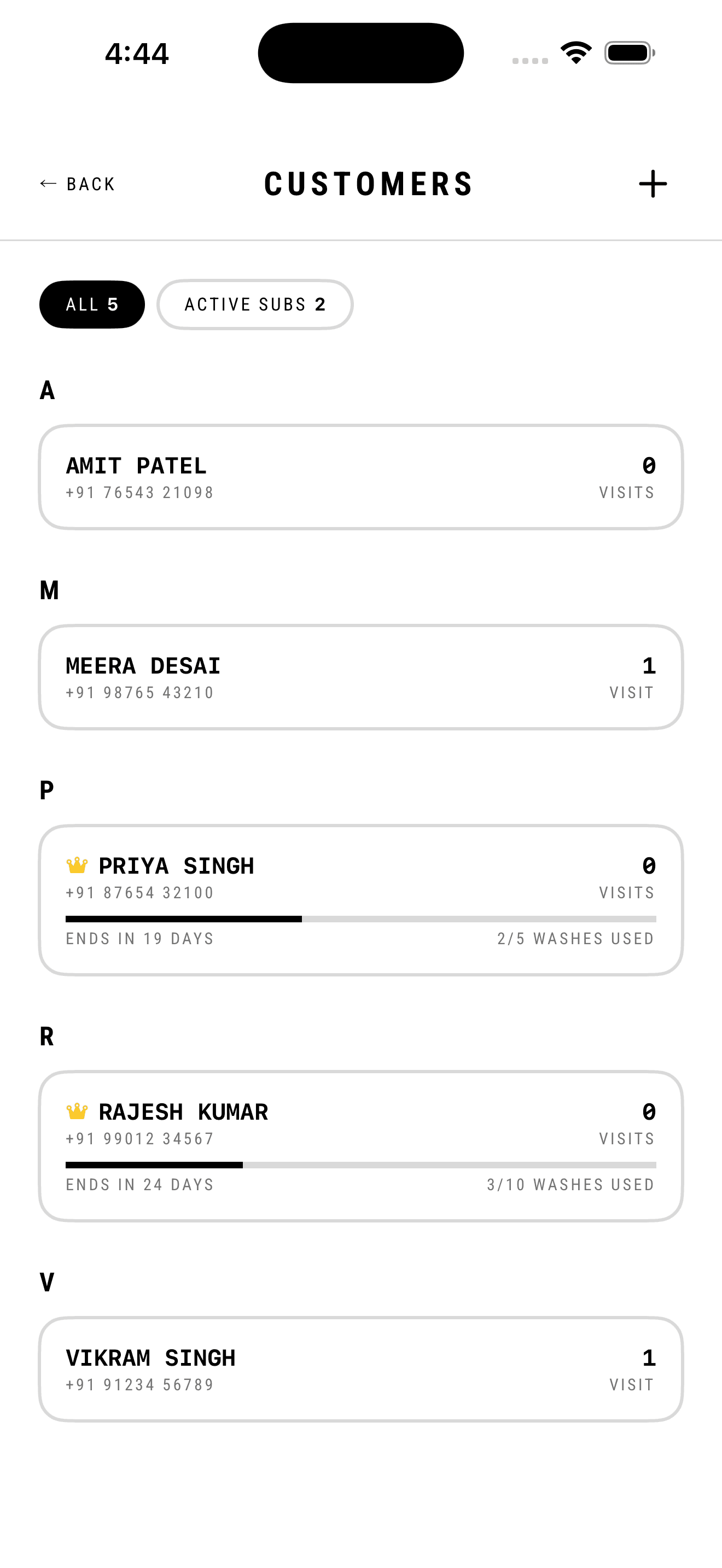
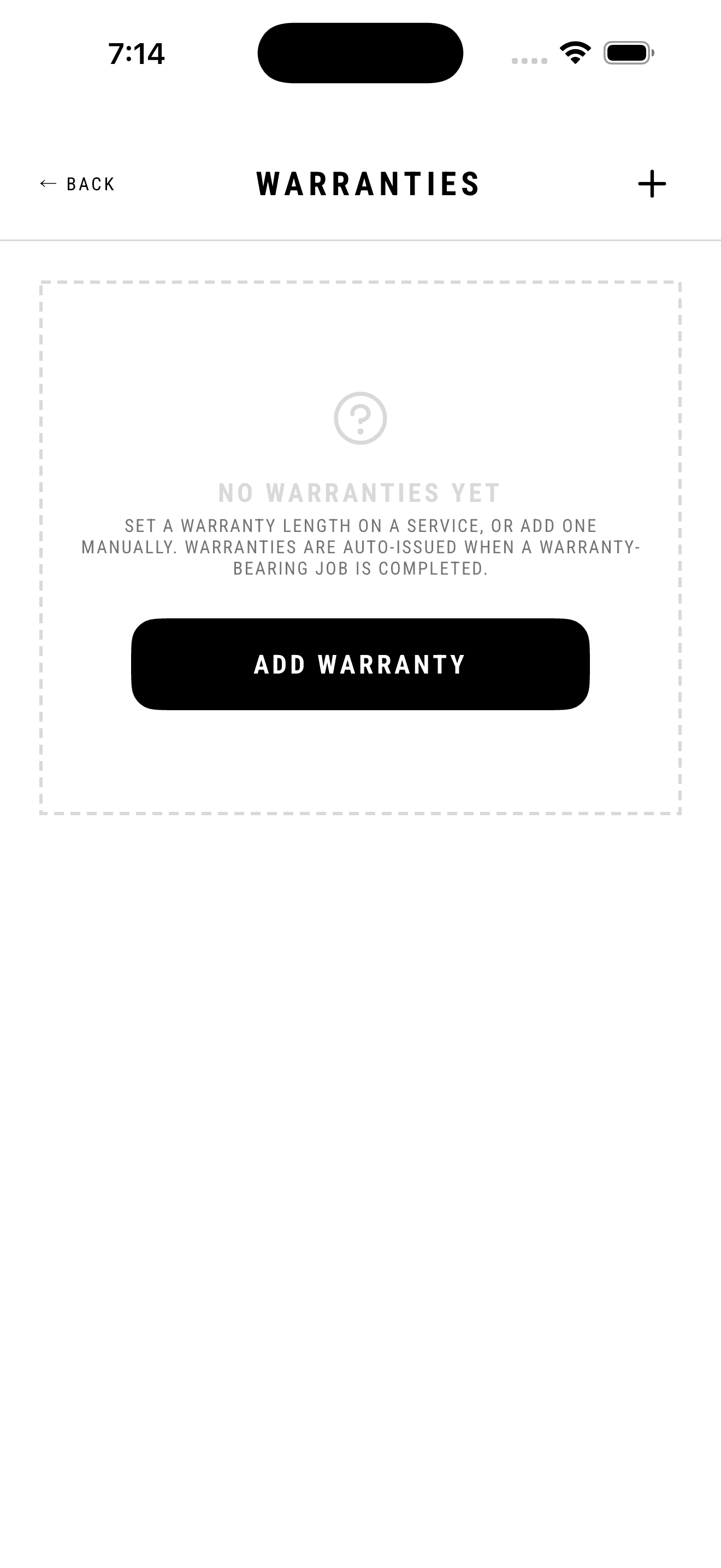
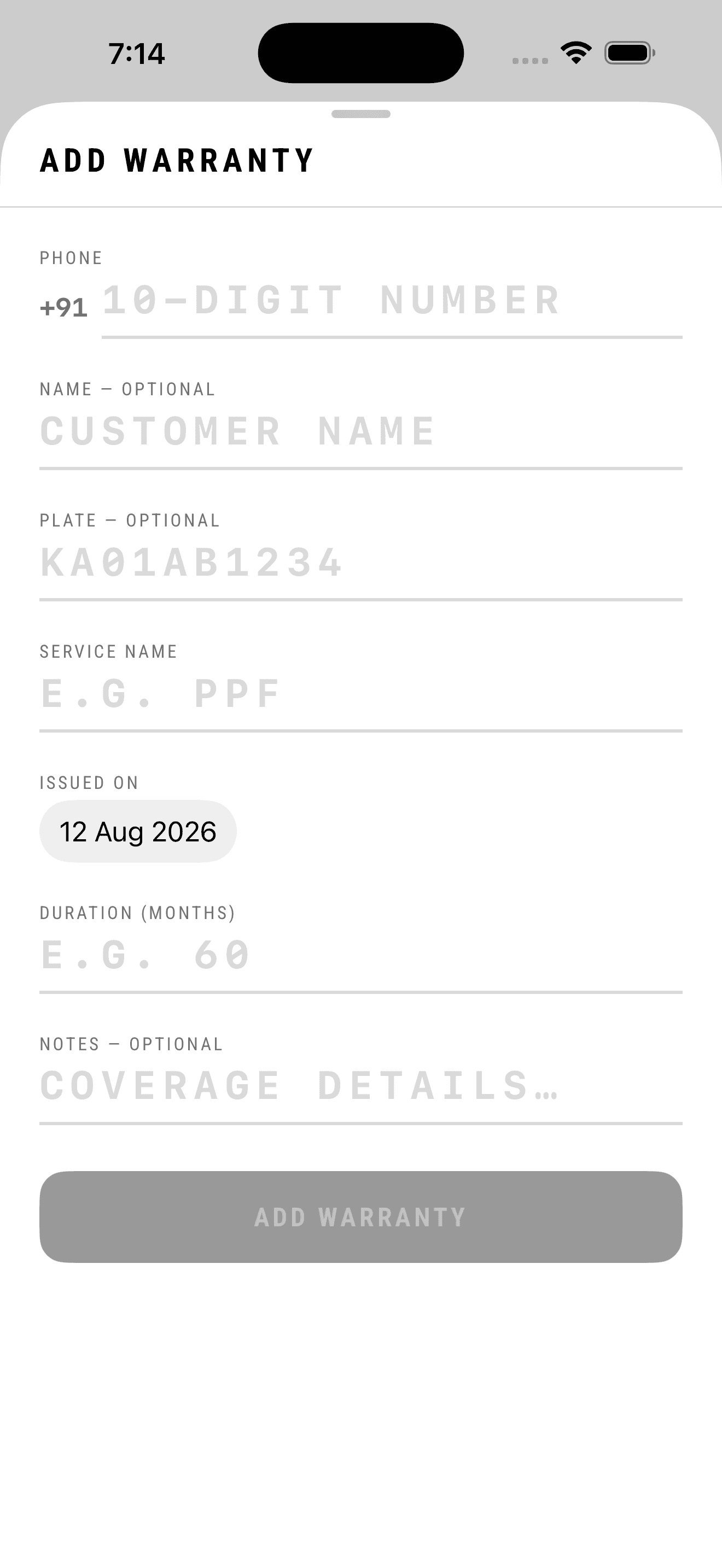
The customer list is alphabetical with a visit count per row, and two filters — everyone, or just active subscriptions. Subscribers carry a marker and a consumption bar in the row itself: two of five washes used, ends in nineteen days. That's the entire question answered without a tap, which is the point; a screen you have to drill into is a screen that loses to a phone call. Warranties are issued automatically when a job carrying a warranty completes, so the common case is no work at all. The manual form exists because paper warranties predate the app, and on it only the phone number is required — name and plate are optional, since the number is what people are found by everywhere else in the product.
What it cost
Auto-issue makes warranty length a property of the service, set once and applied to everything after it, which is wrong for the shop that negotiates the promise per customer — they override manually every time. The crown marking a subscriber is also frank decoration in a system that otherwise refuses it; I kept it because subscriber status changes how staff treat a car at the counter, and it needed to survive a glance.
Two lists, because they are two different populations.
4 screens →
What I found
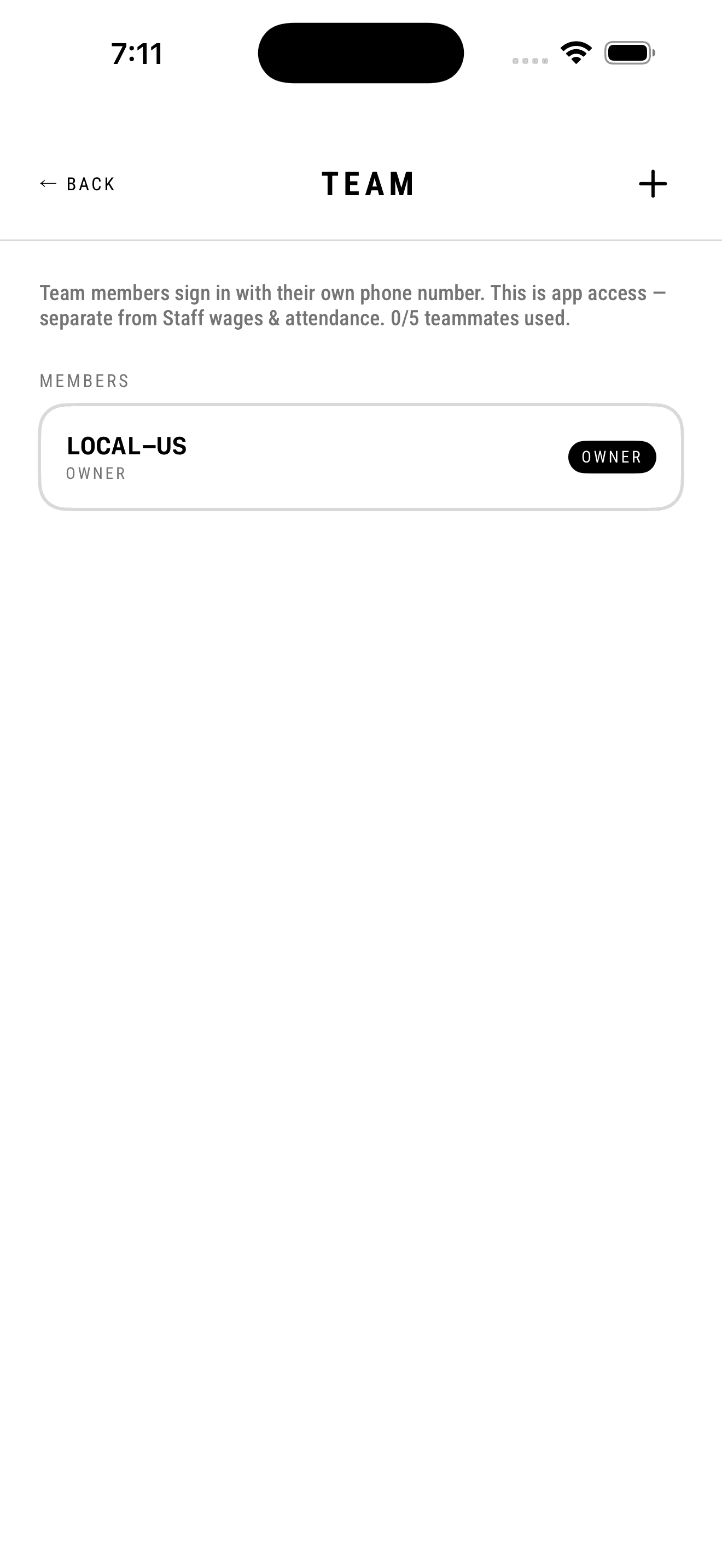
Most small-business software conflates the people who use the app with the people on the payroll. In these shops they are frequently not the same list. A washer may be paid in cash at a daily rate and never touch a phone during a shift, while a family member who does no washing has full access to the money. Merging them forces one of two wrong outcomes: every washer gets a login they don't want, or every login creates a wage line that doesn't exist.
What I decided
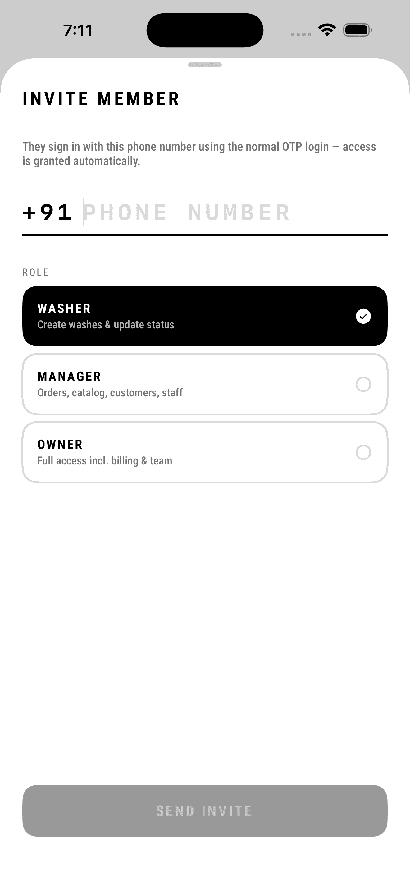
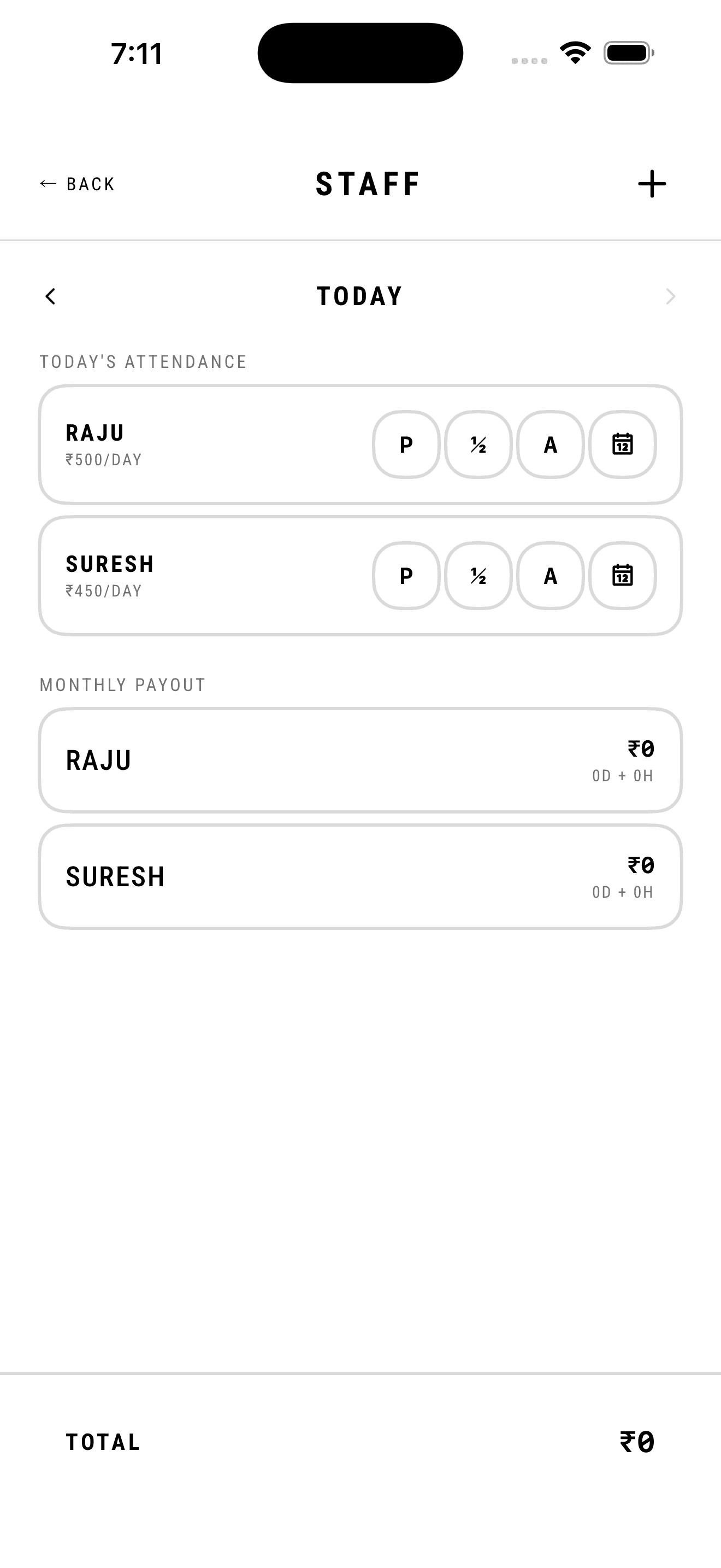
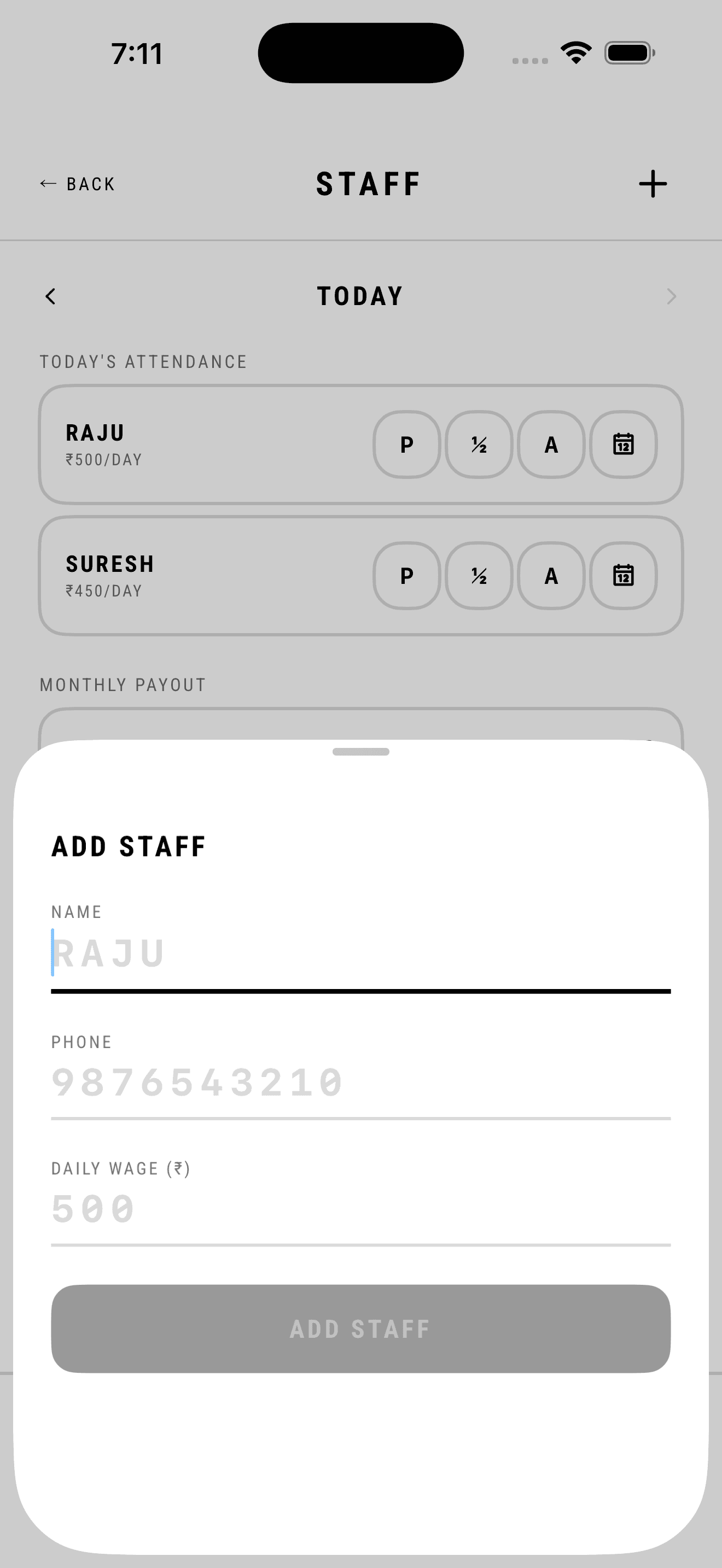
Two screens, kept apart, with the Team screen stating the distinction in plain language at the top rather than leaving it to be inferred. Team is app access: invite by phone number — the same number that is already the login, so there is no second credential — and pick one of three roles, each described by what it can do rather than named and left ambiguous. Staff is wages and attendance: a daily rate per person and a three-button control for present, half day, absent, sized to be hit while walking past. Monthly payout accrues from those taps and totals at the bottom, so the number a shop pays out on the first of the month is a consequence of the same interaction, not a separate reconciliation.
What it cost
Two lists for what an owner calls 'my guys' is a real conceptual cost, and I have watched the same name get entered in both places by someone who assumed they were the same thing. Half day as the only middle option is also blunt — it can't express four hours — but an hours field turns a one-tap action into a keyboard interaction repeated across every person every day, and that is the version that stops getting done by Wednesday.
One screen answers a staffing question, one answers the accountant.
2 screens →
What I found
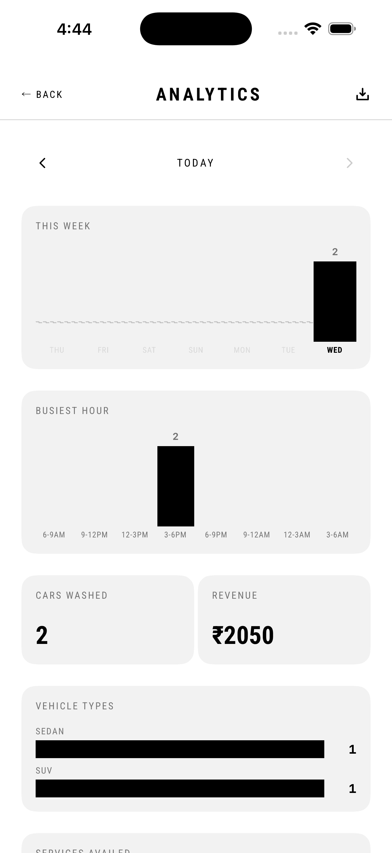
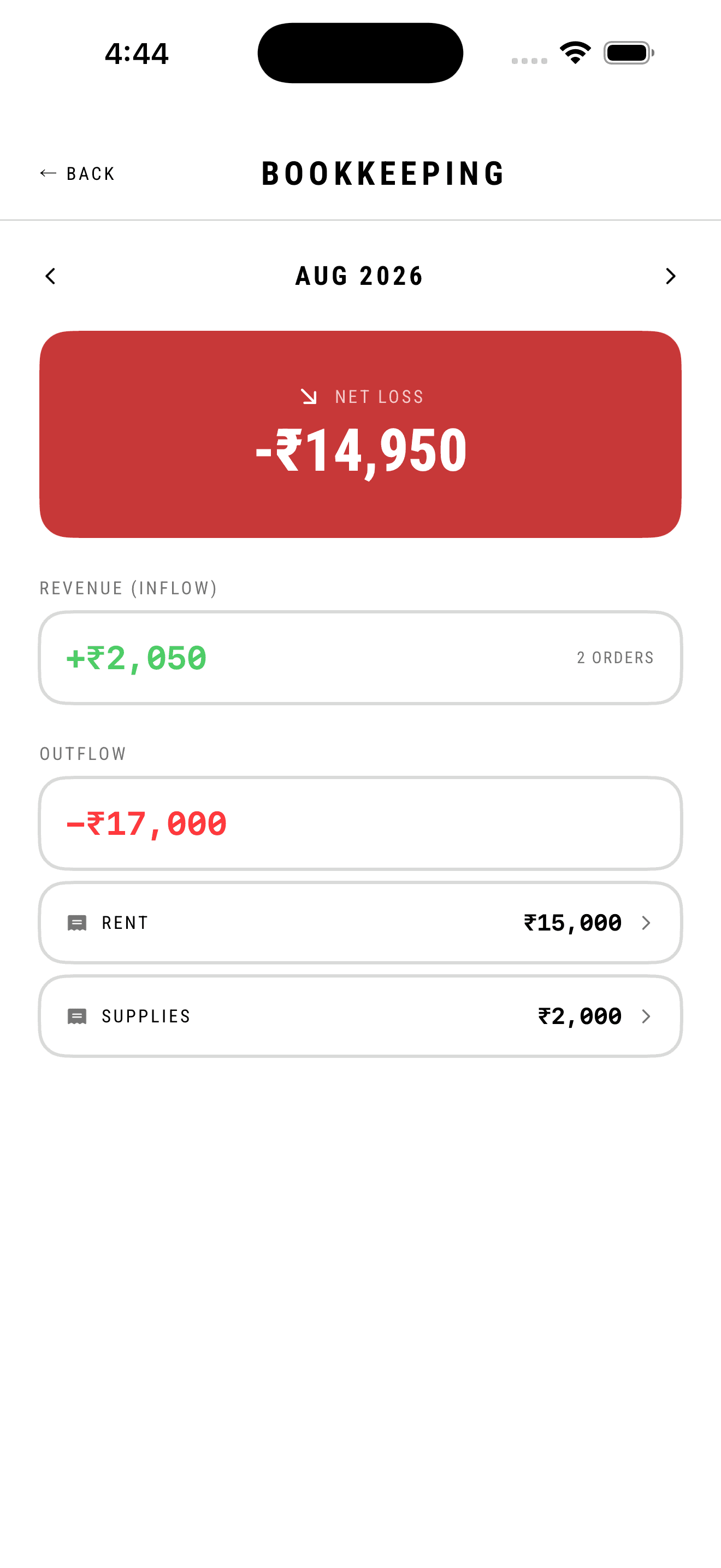
Small operators don't want dashboards, they want decisions. The genuinely useful operational questions are narrow: when should I have more people on, which vehicles am I actually making money on, and which services are worth keeping on the menu. Revenue-over-time line charts look impressive and change nothing about how the week is run. But revenue is only half the picture — a shop that washed forty cars the week it paid rent has not necessarily made money, and the figure an owner is asked for at month end is a different figure entirely.
What I decided
The two questions get two screens, because they're asked on different clocks — analytics daily, bookkeeping monthly. Busiest hour gets its own histogram in three-hour blocks, because that maps directly onto shift decisions; vehicle types and services availed are plain horizontal bars with counts, no legend, solid black on grey, since nothing here is categorical in a way colour would clarify. Bookkeeping opens on one figure instead: inflow minus outflow, full width, turning brand red the moment it goes negative. Revenue underneath it is derived from completed orders and needs no data entry; outflow is a list of expense rows the shop enters, so the two halves are visibly different in origin.
What it cost
With a day or two of data the analytics screen looks broken — one lonely bar on an empty grid, which is exactly what a new shop sees on the day they most want reassurance the app is working. Weekly aggregation would have looked healthier sooner and destroyed the busiest-hour insight, which is the only thing on that screen that changes a decision. Bookkeeping carries a harder one: showing a five-figure loss in red, on a month where rent landed before the revenue did, is demoralising by design. An owner who can't see a loss can't act on one. The genuine weak point is that expenses are manual, so the figure is only as honest as the last time someone remembered to log a bag of supplies.